Maximising Attention for Publishers: Adnami eAPM Analysis Identifies Website Layout’s Impact on Attention
by on 18th Dec 2023 in News

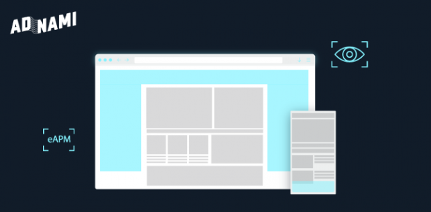
This analysis examines the eAPM data from the Adnami Attention Score to find and develop insights specifically geared towards publishers. These findings review attention in the layout context, specifically for news sites.
The analysis revealed underlying characteristics top-performing news websites share when it comes to attention. These sites generate, on average, 3x more attention than most news sites and share the following traits:
Descriptive headlines and subtext impact attention and time spent. Publishers using descriptive headlines with many characters, generate increased attention performance on the main page, and also harness increased attention performance on the actual article pages. Adnami also found a correlation between the amount of time spent on a publisher's website, page views, and the attention an average user allocates to the ad placed on the respective site. In summary, optimising for attention is also optimising for a better user experience.
More articles in view on the front page generate better eAPMs. From the data Adnami observed that news sites with multiple articles in view on the front page generate up to a 5x better eAPM than those with only one or two. Furthermore, if these articles are accompanied by multiple images, as well as descriptive headlines and subheaders, those sites perform better than those containing only one large image and a short headline.
Subpages are better at creating attention than front pages. The eAPM data shows that news site subpages are better at creating attention than front pages. Further analysis found that articles on subpages attract, on average, double the attention of their front-page counterparts.
Standard ads deliver best performance on mobile devices but still fall short compared to high impact. A general observation but still worth highlighting that findings show that 300x250 banners generate more than 2.5x attention on mobile versus desktop - but still falls short when compared to high impact formats. For example, the Adnami Mobile Midscroll format generated 2.2x more attention than a 300x250 mobile banner.
In summary Adnami found that publishers have a lot of control over the attention outcomes produced by the ad impressions they generate. Website layout is a direct driver of how strongly (or poorly) a website performs when it comes to attention outcomes.
Based on the above, attention is a valuable and actionable metric for publishers that can be used to improve performance. Understanding and optimising for attention translates into an enhanced user experience and leads to better advertising outcomes.
Read the full and detailed findings here.
AnalyticsAttentionPublisherResearch


Follow ExchangeWire